
A New Hugo-Based Blog
In my previous post I talked a little about why and how I started this blog. Here I want to present my experience with Hugo and what I like about it.
Late in 2018 I came across Hugo, a static site generator written in Go. Dissatisfied with Jekyll, I needed a different static site generator, and I had been learning Go at Work. This looked like a good opportunity to try blogging again.
I stumbled quite badly a few times along the way. I thought a theme would help me get my site up and running quickly, but they don’t balance well with my need to twiddle with the site’s layout and look and feel. The long and short of it is, I took what I learned from trying out a couple of themes, and hunkered down to learn a few things about “The Hugo Way”, and the basics of HTML & CSS.
The Short-lived Academic Theme
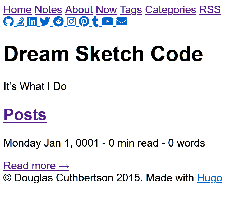
As I have a tendency to do with new tools, I dove in too deep, too fast. Hugo has themes, and they look like a good way to get something up and running quickly. I looked over [`]the theme gallery](https://themes.gohugo.io/) checking all the features and how they looked. Academic is very flexible and chock full of features. I decided to give it a whirl in February 2019. It looked like this out of the box.
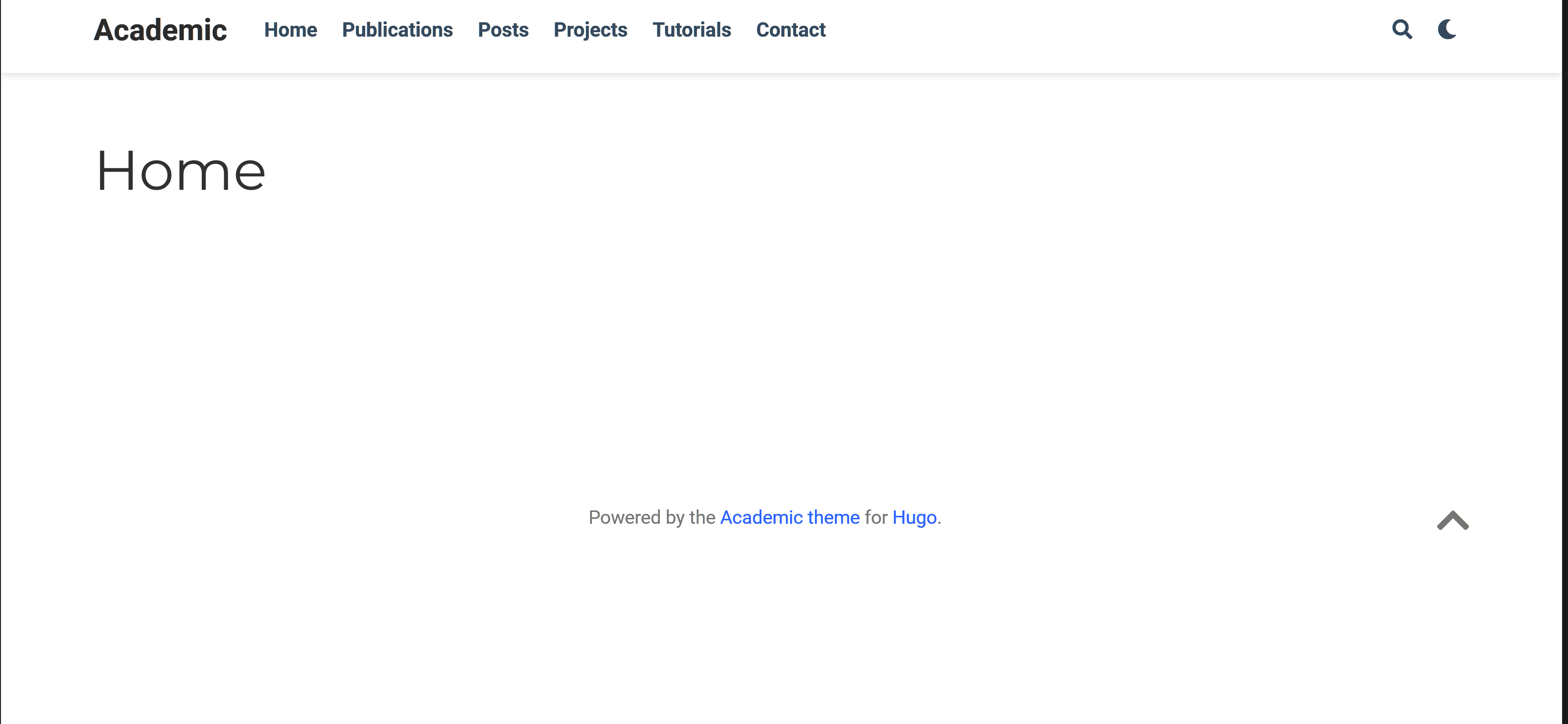
I tried a few small configuration changes to see how I liked it. My hope was only minor changes would be necessary so I could have a site that looked good to me and had a responsive layout. That way I could just write posts.
Quick Switch to Vanilla Bootstrap
Sadly, Academic was short lived. By the 9th of the month I gave up on it. For all the features it has, I found it too hard to configure and customize. Don’t get me wrong. Academic is amazing and has good documentation, but this theme has its own themes. It’s a little more complex than what I needed. Also, I didn’t realize at the time, but Academic isn’t just a Hugo theme. It is a website builder. It uses Hugo as an engine to bring life to a website rather than being a set of content-decorators run by Hugo.
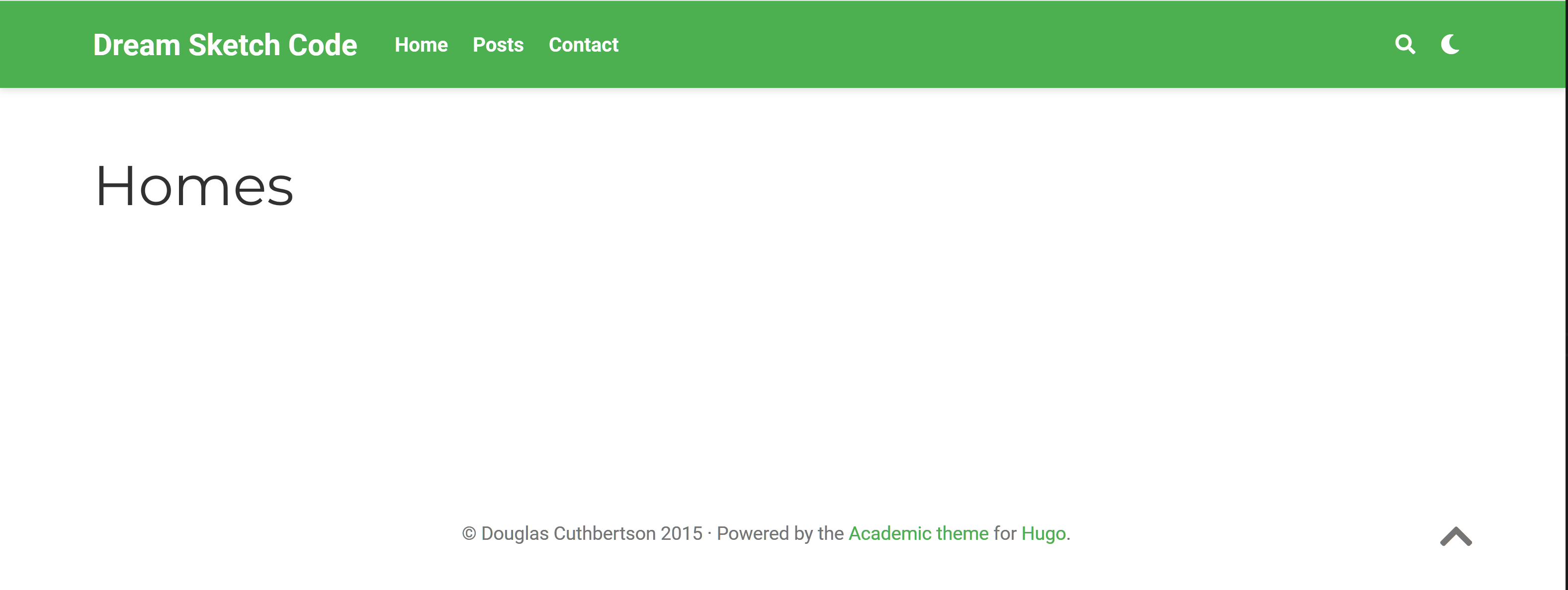
Too new to how Hugo workds and the complexities of a website builder, I looked for a simpler solution and settled on Vanilla Bootstrap.
The change was dramatic and configuration was simplified. While Academic has two levels of configuration, the core through config/_default/config.toml and another level controlled through the content in the content/home directory, Vanilla Bootstrap requires only core configuration of Hugo and a handful of theme-specific parameters all managed through the default configuration files.
A New Navigation Menu
It looked pretty good for a few hours of work. It was easy to define a menu at the top of the home page providing links to other pages. Most of what I needed to define the menus was contained in config/_default/config.toml:
  # See https://feathericons.com/
  # The value of pre is the icon name
  [menu]
    [[menu.nav]]
      name = "Home"
      pre = "home"
      url = "/"
      weight = 1
    [[menu.nav]]
      name = "Notes"
      pre = "edit"
      url = "/notes/"
      weight = 2
    [[menu.nav]]
      name = "About"
      pre = "smile"
      url = "/about/"
      weight = 3
    [[menu.nav]]
      name = "Now"
      pre = "play"
      url = "/now/"
      weight = 4
    [[menu.nav]]
      name = "RSS"
      pre = "rss"
      url = "/index.xml"
      weight = 5
The theme provides the other major component in theme/vanilla/layouts/partials/nav.html:
  <div id="nav-border" class="container">
    <nav id="nav" class="nav justify-content-center">
    {{ $showActiveNav := .Site.Params.showActiveNav }}
    {{ $currentPage := . }}
    {{ range .Site.Menus.nav }}
      {{ $active := "" }}
      {{ if eq $showActiveNav true }}
        {{ $isMenu := or ($currentPage.IsMenuCurrent "nav" .) ($currentPage.HasMenuCurrent "nav" .) }}
        {{ if or $isMenu (eq $currentPage.Title .Name) }}
          {{ $active = "nav-link-active" }}
        {{ end }}
      {{ end }}
      {{ $icon := printf "<i data-feather=\"%s\"></i>" .Pre }}
      {{ $text := print $icon " " .Name | safeHTML }}
      <a class="nav-link {{ $active }}" href="{{ .URL }}">{{ $text }}</a>
    {{ end }}
    </nav>
  </div>
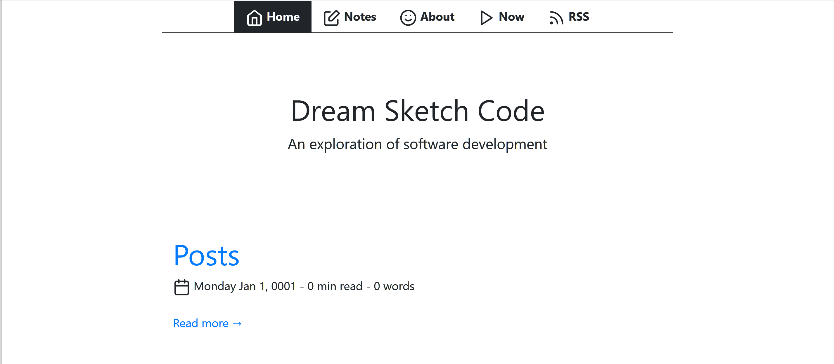
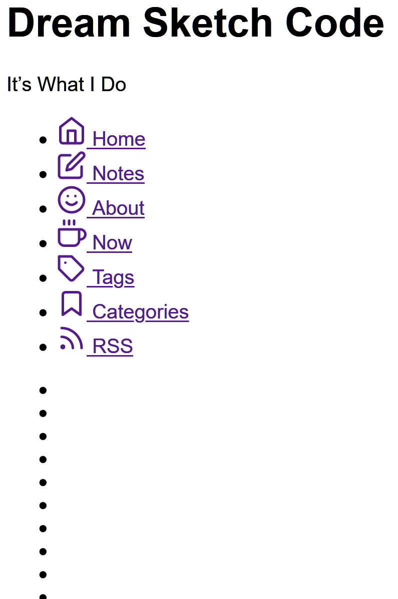
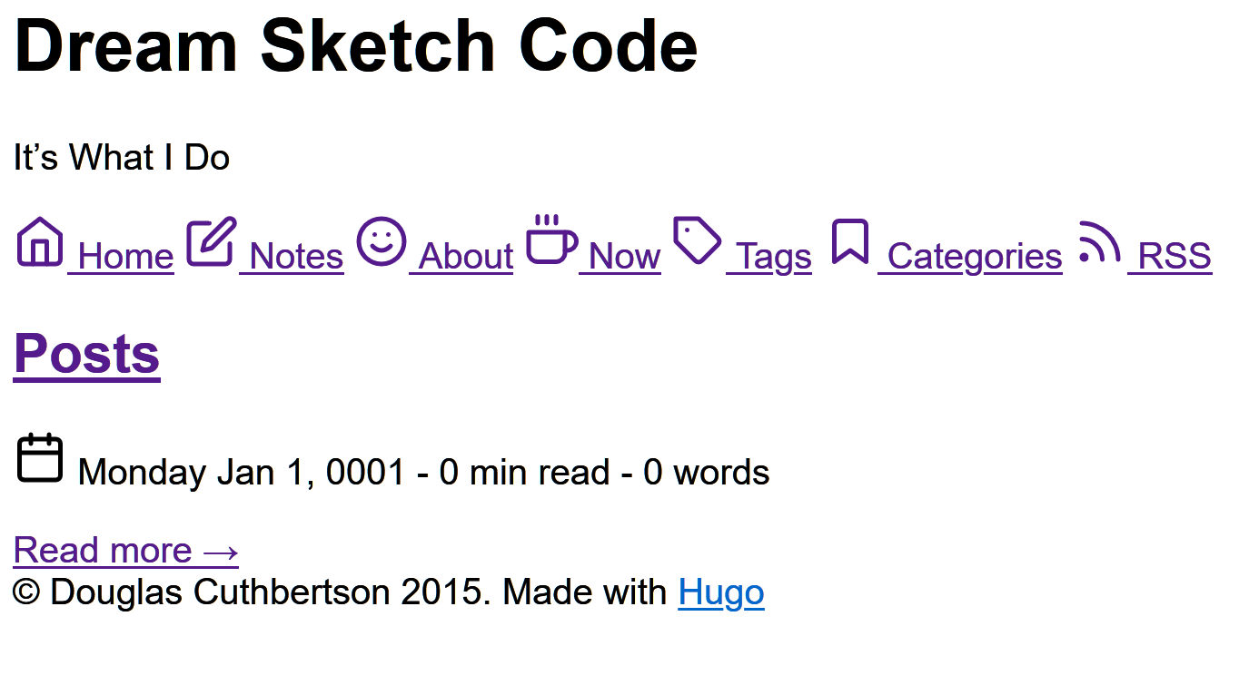
It cycles through the menu.nav items in config.toml and translates those values to a feather icon, text, and a link to the given URL. The site was beginning to fill out, although today the icons look silly to me.
There’s a “Notes” menu item, because I thought I would use the site to keep notes as well as regular blog posts. I’ve since separated my personal notes and works-in-progress from blog posts. I’m willing to go only so far in what I make public. It’s best to keep some thoughts as background material, and let others stew for a while before publicizing them.
I created a simple 404 page, and a big “jumbotron” area for all the index pages. The site was beginning to fill out. Although, today the icons look silly to me.

The note is dated April 8, 2019 because that was my goal for publishing the site. It took a little longer than I expected. Mostly, I was unsure about putting up my notes in public, the design was poor, and I thought I should do better.
In hindsight, content is more important than style. It would have been better to write posts and develop the site simultaneously.
More Puttering Around with Layout
It was still early February, and I was learning how Hugo worked, it’s configuration system, and how and where to integrate CSS, SCSS, and JavaScript (particularly MathJax). I spent time breaking up the layout into partials for more consistency across the site.
I added a picture of Motif No. 1 I took in Rockport, Massachusetts to fill the jumbotron. It got cropped rather poorly, though.

MathJax
I was happy to learn a little about configuring MathJax. It makes it possible to display equations on web pages. To configure MathJax to automatically number equations - just include the following in layouts/partials/script.html (which is included in layouts/_default/baseof.html):
  <!-- Configure MathJax for automatic equation numbering. See
    http://docs.mathjax.org/en/latest/tex.html#automatic-equation-numbering
    for details
  -->
  <script type="text/x-mathjax-config">
    MathJax.Hub.Config({
      TeX: { equationNumbers: { autoNumber: "AMS" } }
    });
  </script>
I realize that MathJax is a large JavaScript library. It’s probably stupid to try optimizations without testing, nevertheless I didn’t want to load MathJax with every page. Most pages don’t require it, so I wrap the MathJax configuration in an if-block that detects if the page (or the whole site) defines the parameter math. The configuration has been updated, as well.
Now all I have to do is add math: true to the front matter of any file that includes \(\LaTeX\).
  <!-- Include MathJaX if either the page or the site params define math=true -->
  {{- if or .Params.math .Site.Params.math -}}
  <!-- Configure MathJax for automatic equation numbering. See
    https://docs.mathjax.org/en/latest/tex.html#automatic-equation-numbering
    for details.
    Also, for tex2jax configuration see https://docs.mathjax.org/en/latest/
    options/preprocessors/tex2jax.html

    Note that the double-backslashes are very important. Without them ordinary
    markdown will interpret (parenthetical statements) as inline math, and cause
    similar problems if text is put between '[' and ']'.
  -->
  <script type="text/x-mathjax-config">
    MathJax.Hub.Config({
      TeX: { equationNumbers: { autoNumber: "AMS" },
              extensions: ["AMSmath.js", "AMSsymbols.js"] },
      tex2jax: {
        inlineMath: [['$','$'], ['\\(','\\)']],
        displayMath: [['$$','$$'], ['\\[','\\]']],
        processEscapes: true,
        processEnvironments: true,
        skipTags: ['script', 'noscript', 'style', 'textarea', 'pre', 'code']
      }
    });
  </script>
In addition to being updated, it tries to load from a Cloudflare, but if it can’t connect it loads a local copy.
  <!--
    Load MathJax. Note that this is one of the most general configurations.
    See the configuration docs for others. There might be a lighter version
    that will work for my purposes.
    https://docs.mathjax.org/en/latest/config-files.html#common-configurations
  -->
  <!-- MathJax: Fall back to local if your computer is offline and can't connect
    to the CDN. For convenience, the configuration for the fallback deactivates
    image fonts support (imageFont:null). This allows you to host a slim local
    copy by deleting the PNG fonts.-->
  <script async type="text/javascript" src='https://cdnjs.cloudflare.com/ajax/libs/mathjax/2.7.5/MathJax.js?config=TeX-MML-AM_CHTML'></script>

  <script>window.MathJax || document.write('<script type="text/x-mathjax-config">MathJax.Hub.Config({"HTML-CSS":{imageFont:null}});<\/script><script type="text/javascript" src="{{ "scripts/MathJax-2.7.5/MathJax.js" | absURL }}?config=TeX-AMS-MML_HTMLorMML"><\/script>')</script>
  {{- end -}}
Pagination
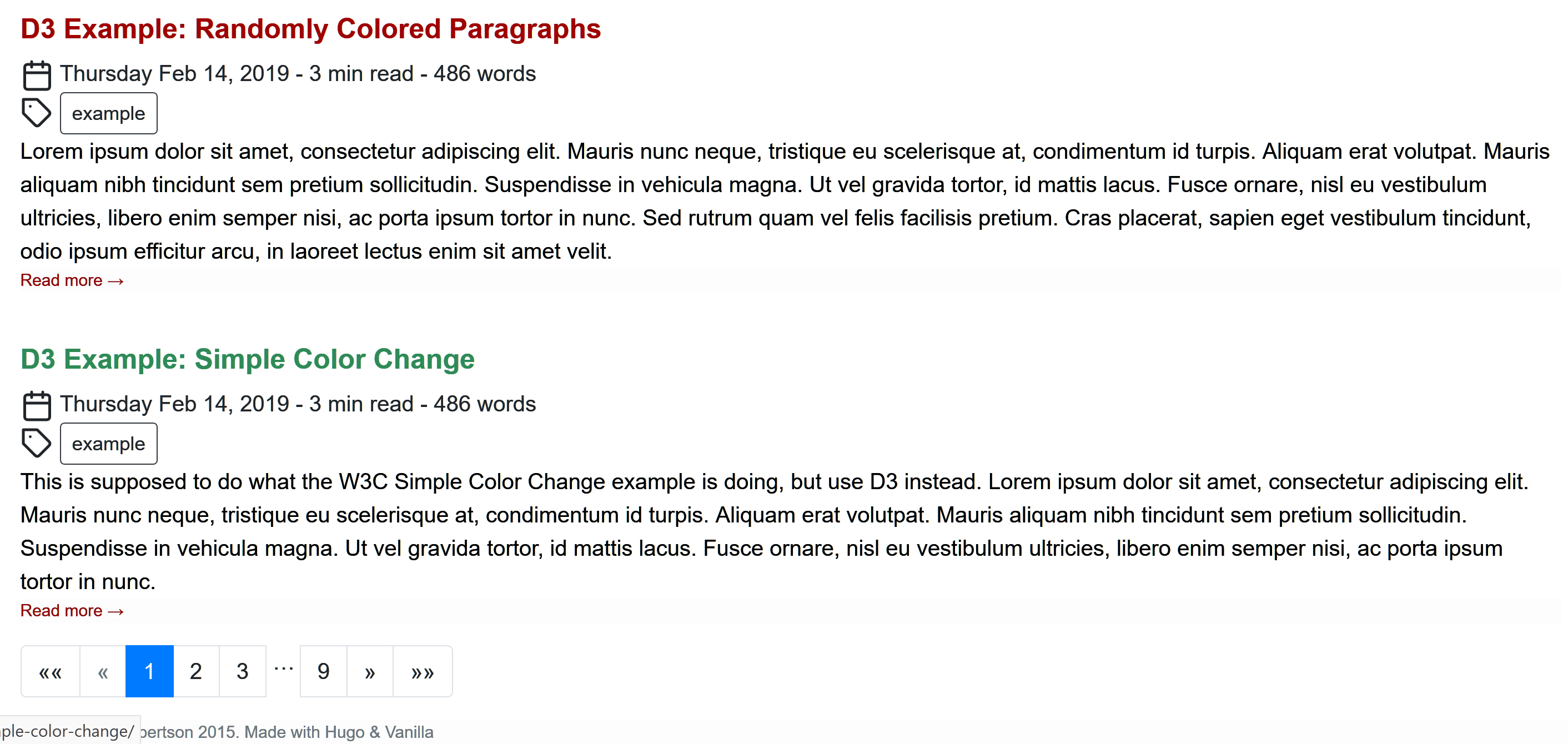
I had added lots of notes and the layout was still sprinkled with distracting icons, this time with a redish theme and green accents. I had at least learned how to paginate my page lists. For example, the default list (layouts/_default/list.html) used Hugo’s built-in pagination:
  {{ define "main" }}

  <main>
      <!-- default list template -->
      <article>
        <!-- "{{.Content}}" pulls from the markdown content of the corresponding _index.md -->
        {{ .Content }}
      <!-- Paginates through content/note/*.md -->
      {{ $paginator := .Paginate (where .Pages "Type" "note") }}
      {{ range $paginator.Pages }}
        <h2><a class="font-125" href="{{ .Permalink }}">{{ .Title }}</a></h2>
        <div class="article-meta-data">
          {{ partial "date-and-tags.html" . }}
          <!-- this renders based on layouts/_default/summary.html (either the
          local one, or the one in a theme -->
          {{ .Render "summary" }}
        </div>
      {{ end }}
      {{ template "_internal/pagination.html" . }}
      </article>
  </main>

  {{ end }}
Scrollbar Jumping
At some point I noticed that when navigating from a page that had no scrollbar (like a short post or note) to one that did (such as the paginated lists of notes displayed above) the whole layout shifted slightly. I found a fix for it at CSS-Tricks.
At the time, I had a layouts/partials/style.html partial file. All I had to do was add a few lines of CSS to it:
  html {
    margin-left: calc(100vw - 100%);
    margin-right: 0;
  }
SCSS Pipeline Processing
By April I had setup a pipeline for processing SCSS into CSS. The pipeline consisted of this small amount of template code:
  <!-- For more info about using SCSS and this pipeline see:
    https://github.com/gohugoio/hugo/commit/dea71670c059ab4d5a42bd22503f18c087dd22d4,
    https://gohugo.io/hugo-pipes/scss-sass/, https://gohugo.io/hugo-pipes/postcss/,
    and https://gohugo.io/hugo-pipes/
  -->
  {{ $style := resources.Get "sass/main.scss" | toCSS | minify | fingerprint }}
  <link rel="stylesheet" href="{{ $style.RelPermalink }}" integrity="{{ $style.Data.Digest }}" media="screen">
The main.scss file lived in assets/scss/ at the root of the repository.
Sorry Vanilla. You have to Go
One aspect of design I didn’t enjoy was trying to figure out the correct CSS classes to apply to a given situation. For example, the body element is <body class="d-flex flex-column h-100">. I have no idea what those classes mean and why I need them, so I started learning more about HTML and CSS.
My new goal was to really understand the structure of my site, so I know where things are, what needs to be modified as I build it to look the way I want it to, and know the elements and classes defined in the layout so they can be styled correctly. Vanilla Bootstrap was a nice place to start, but I don’t understand the choices made for structure and styling. Its use of Bootstrap added another layer of complexity to learning how changes to CSS will affect the site.
In the middle of April, I ripped out Vanilla Bootstrap and started over.
Weird. I started off the year with a sophisticated theme, because I thought it would help me get to a nice looking website fast. I found the large array of options in Academic to be overwhelming.
Switching to the theme to Vanilla enabled me to learn more about layout and styling, but what I wound up with was cutesy and still too difficult to reason about when it came to knowing which levers to pull and dials to turn to affect the layout and styling in a predictable way.
Ripping out Vanilla left me with a barebones layout. Here are some of the things I learned along the way to creating a site more to my liking.
Navigation Menu
By late April, I learned that navigation links didn’t have to be wrapped in an unordered list. Looking through git log, I found the navigation menu had always been wrapped in an unordered list.
  <ul class="navbar-nav mr-auto">
    <li class="nav-item">
      <a class="nav-link" href="/#about" data-target="#about">
        <span>Home</span>
      </a>
    </li>
    <li class="nav-item">
      <a class="nav-link" href="/#publications_featured" data-target="#publications_featured">
        <span>Publications</span>
      </a>
    </li>
Now I have just a <nav> element that wraps a <div>:
  <nav class="main-nav">
    <div class="main-nav__items">
      <a class="main-nav__link navLink-active" href="http://localhost:1414/">Home</a>
      <a class="main-nav__link " href="http://localhost:1414/about/">About</a>
      <a class="main-nav__link " href="http://localhost:1414/now/">Now</a>
      <a class="main-nav__link " href="http://localhost:1414/index.xml">RSS</a>
    </div>
  </nav>
The CSS for this section consists of class definitions for main-nav and main-nav__items. It is very simple, and doesn’t even try to style the main-nav__link class.
  .main-nav {
    display: flex;
    justify-content: flex-start;
  }

  .main-nav__items a {
    font-size: 1.1em;
    margin-right: 1ch;
  }
Unwrapping them changed navigation from:
to this:
General Layout
Per the MDN docs on box-sizing border-box makes dealing with the sizes of elements much easier, and generally eliminates a number of pitfalls you can stumble on while laying out your content, so I set border-box globally.
  * {
    box-sizing: border-box;
  }
I learned I can set site-wide parameters in Hugo’s configuration files. I set the site width and several other parameters in config/_default/params.toml:
  showActiveNav = true
  author = "Douglas Cuthbertson"
  description = "This is my soapbox for thoughts on programming, project planning, sketching, drawing, kempo, and any other topic that may suit my fancy."
  dateFormat = "Monday Jan 2, 2006"
  dateFormatExtended = "Monday Jan 2, 2006 15:04"
  homeText = ""
  copyright = "(c) 2015-2020 Douglas Cuthbertson. This work is licensed under the [Creative Commons Attribution 4.0 (CC BY 4.0), International License](https://creativecommons.org/licenses/by/4.0/)"
  footerText = "Made with HTML, CSS, JavaScript, and perseverance. Generated by [Hugo](https://gohugo.io/)"
  hideFooter = false
  #featured_image = "/images/gargoyle-overlooking-paris.jpg"
  #featured_image = "/images/motif-number-1.jpg"
  site_width = "104ch"

  componentDropCaps = "drop-caps_goudy"
  mainSections = ["note", "post", "project"]
  planck = "\u210E"
  reduced_planck = "\u210F"
and use site_width in assets/style/base.css as follows:
  {{ $siteWidth := .Site.Params.site_width }}
  {{ if not .Site.Params.site_width }}
  {{ $siteWidth = "936px" }}
  {{ end }}
I’ve only recently decided that this is a bad idea. Every time I try to experiment with the site width, I have to touch the configuration. Hugo must go through a complete rebuild of the site, which takes much more time than necessary.
The only reason to put a parameter in a configuration file is if the value must be accessed from more than one place. In this case, it was needed only in a single CSS file. Once I defined the width directly in base.css, site rebuilds were faster, and my CSS is no longer cluttered with Go template code. Also, layouts/partials/head.html was slightly simplified. Instead of accessing base.css as
{{ $cssBase := resources.Get "style/base.css" | resources.ExecuteAsTemplate "style.base.css" . }}
the code is now
{{ $cssBase := resources.Get "style/base.css" }}
Color Consistency and Contrast
In May I was trying to ensure colors were being used consistently. I learned that the site should have primary and accent colors, and define the color of the body text. Some designers say that black text on a white background is too harsh and set dark gray text on a light gray background. When I look at those sites, I find the contrast is often too low and causes eye strain. I originally just went with black text on white. I figured it’s a work in progress, and that can be adjusted when the rest of the site is more to my liking.
In deference to experienced designers I now set the text to a very dark gray on a very light gray background. I created a palette using CSS custom properties:
  :root {
    --color100: #f5fffa;
    --color200: #7cffbb;
    --color300: #00eb75;
    --color400: #00c663;
    --color500: #00a151;
    --color600: #007c3e;
    --color700: #00572c;
    --color800: #003219;
    --color900: #000b05;
    --gray100: #fcfcfc;
    --gray200: #dedede;
    --gray300: #bfbfbf;
    --gray400: #a1a1a1;
    --gray500: #828282;
    --gray600: #636363;
    --gray700: #454545;
    --gray800: #262626;
    --gray900: #080808; /* text */
    --color500-complement: #a30052; /* anchor hover */
    --color500-adjacent: #0062a3; /* drop-caps */
    --color500-adjacent-complement: #a34100; /* reserved */
    --color700-complement: #00572b;
    --color700-adjacent: #003457;
    --color700-adjacent-complement: #572300;
  }
I like this aspect of CSS. It means I can define all the colors I care about in one place, and I don’t have to learn SCSS at the moment to do it.
Some sites eschew black text on a white background. For example, Web Design in 4 Minutes recommends using a medium gray (#555) for body text, a dark gray (#333) for headings and strong text all against a white background. However that creates a rather low contrast. To make matters worse, the background for code blocks is set to #eee.
The Web Content Accessibility Guidelines recommends a contrast ratio of at least 7:1 for normal text and 4.5:1 for large text. Large text is defined as 14 point (typically 18.66px) and bold or larger, or 18 point (typically 24px) or larger. The contrast ratio for headings set to #333 against white is strong at 12.62:1. Body text set to #555 against white is barely acceptable at 7.46:1. Finally, the constrast ratio of code blocks (#555 against a background of #eee) is unacceptable at 6.42:1.
Originally, I had black text on a white background. In deference to designers who have a lot more experience creating web sites than I do, I set the background and text colors to the lightest and darkest grays in the palette, respectively.
  body {
    background-color: var(--gray100);
    color: var(--gray900);
  }
The contrast ratio is 19.52:1. Is that too high? One day I’ll look into separate degrees of contrast for body text and headings.
Styling Fun
One thing I particularly liked was how nice drop caps looked on Gwern. I looked at his CSS and created a new file, static\style\drop-caps\drop-caps.css with a simplified version of his CSS. I dropped it in the static/ directory instead of the assets/ folder out of expediency, and I modified layouts/_default/baseof.html to pull in the drop caps definitions.
By the end of June I removed most of the feather icons and simplified the layout. It looked better.

Debugging Layouts
A simple trick to help debug layouts is to put a high-contrast border and background color around the sections you’re working on.
  .wrapper > * {
    border: 2px solid #f08c00;
    background-color: #ffec99;
    border-radius: 5px;
    padding: 10px;
  }
A little thing like that helped me make a two column layout.

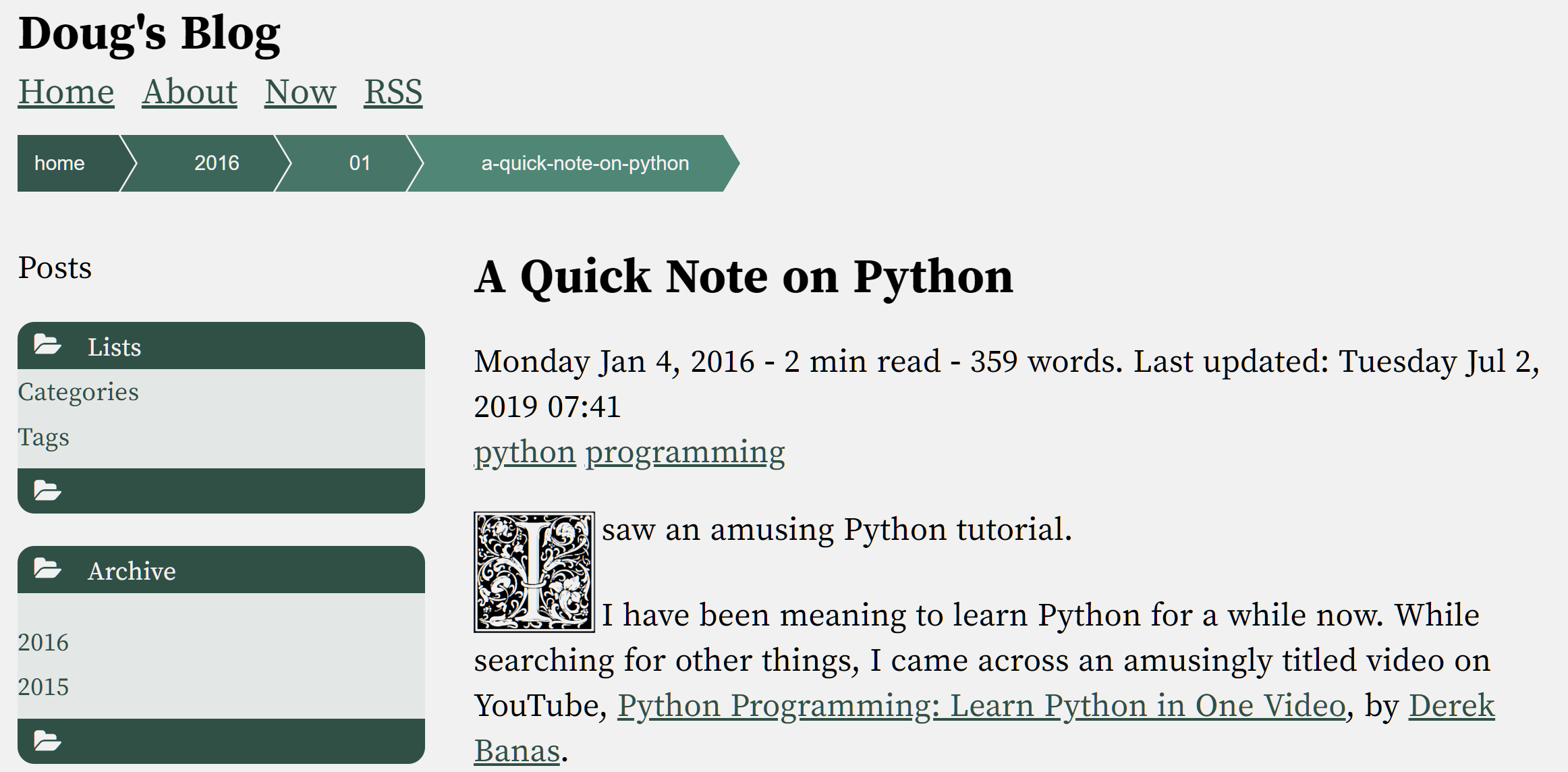
By the end of September last year, I had restructured a lot of the blog. It has a stronger two-column layout and a splash of color.
Since then, I’ve been periodically iterating on the design. It is pretty much complete and I’m generally happy with the way it has turned out. I’ll continue to fiddle with it here and there, but I plan to write about things with which I’m more familiar.